
This is the journey of finding ‘ME’ – my identity of 2T
— I have been on and off working on my own logo, try to find my own voice to sync with my logo. I tried to use my last name in Chinese which is cool.
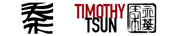
LEFT: Last Name in Chinese writing. ‘Qin’ for pronouncing in Mandarin and ‘Chun’ for pronouncing in Cantonese.
It was eye-catching. I even added my Chinese Name stamp (I got it from my dad who went to a place in Hong Kong to get it custom made for me). So I use it on my design portfolio site. But for most people it may not be communicating that well and look quite formal.

2T concept like a tire thread impression.
Then, I came to a chance to put up my work on Behance because I need to have one there to share portfolio for review in Adobe Live (#adobelive). That makes me to rethink my logo since the one on my own site is horizontal format and not work good with square/circle environment. So I tried to put ‘T’ and ‘T’ together like a tire thread, it was cool for a while, it is well-balance with figure/ground concept. But still it is not ‘really me’.
At this point, I try to combine two ‘T’s together, I have tried several ways.
The combination of TWO hand-drawn Ts.

Tee shirt symbol hand-drawn, then studying hand writing of ‘T’s

Logo sketch of Ts composition.

But finally I house a small ‘T’ at the bottom of the big ‘T’ that way it follows the flow of the brush stroke of the big ‘T’ and I use white to highlight it (it is small but it still really recognizable its existence in this logo identity).
*Simplicity is always the key for identity. It involves a lot of back-and-forth problem solving. It is challenging but it is a good journey for a graphic designer.